
Back
Redesign of the Broma 16 Platform

Operational period: 2024. Platform: Web and responsive version for tablets and smartphones

My role is UX/UI designer
- Support for the current version of the platform.
- Complete redesign of interfaces.
- Analysis of user scenarios and design of new ones.

Project goal
Разработать мобильное приложение для усиления цифрового присутствия, повышения лояльности клиентов и удобного онлайн-шопинга
About the client
Broma 16 is an independent music company that licenses rights to digital content and pays royalties to authors, performers, labels, and publishers. The service brings together over 600 rights holders worldwide and collaborates with platforms like Apple Music, YouTube, Deezer, VK, Yandex.Music, and others.
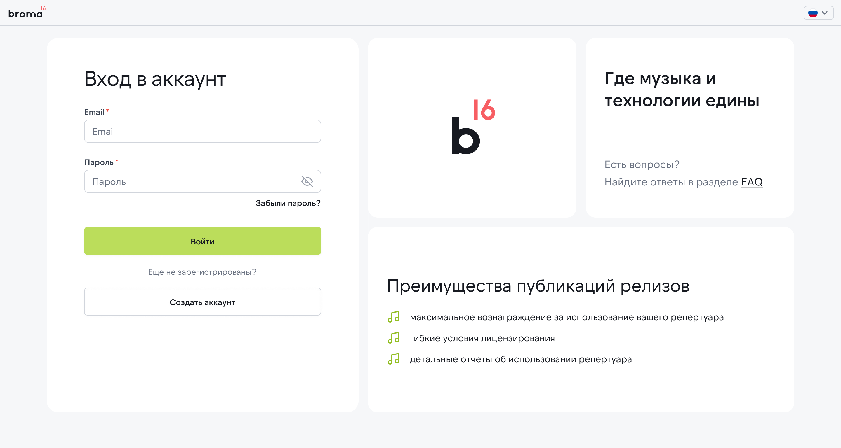
Authorization
Tasks
- Update the overall interface style;
- Identify and address bottlenecks;
- Incorporate new policy rules in the concept to standardize product texts and descriptions;
- Adapt layouts for tablets and smartphones;
- Prototype and test hypotheses;
- Create a new design system;
- Introduce new interface patterns to make the product scalable and ready for functional expansion.
Process
1. Analysis and research
- Conducted interviews with managers and users of the platform.
- Analyzed data structure, reporting logic, and typical scenarios.
- Built a CJM map and identified key frustration points.
2. UX design
- Reconstructed the information architecture.
- Optimized registration, reporting, and search scenarios, etc.
- Created interactive prototypes for key processes.
3. UI design
- Developed a unified visual language: colors, typography, components.
- Implemented a UI kit for interface consistency.
- Prepared responsive versions for tablets and smartphones.
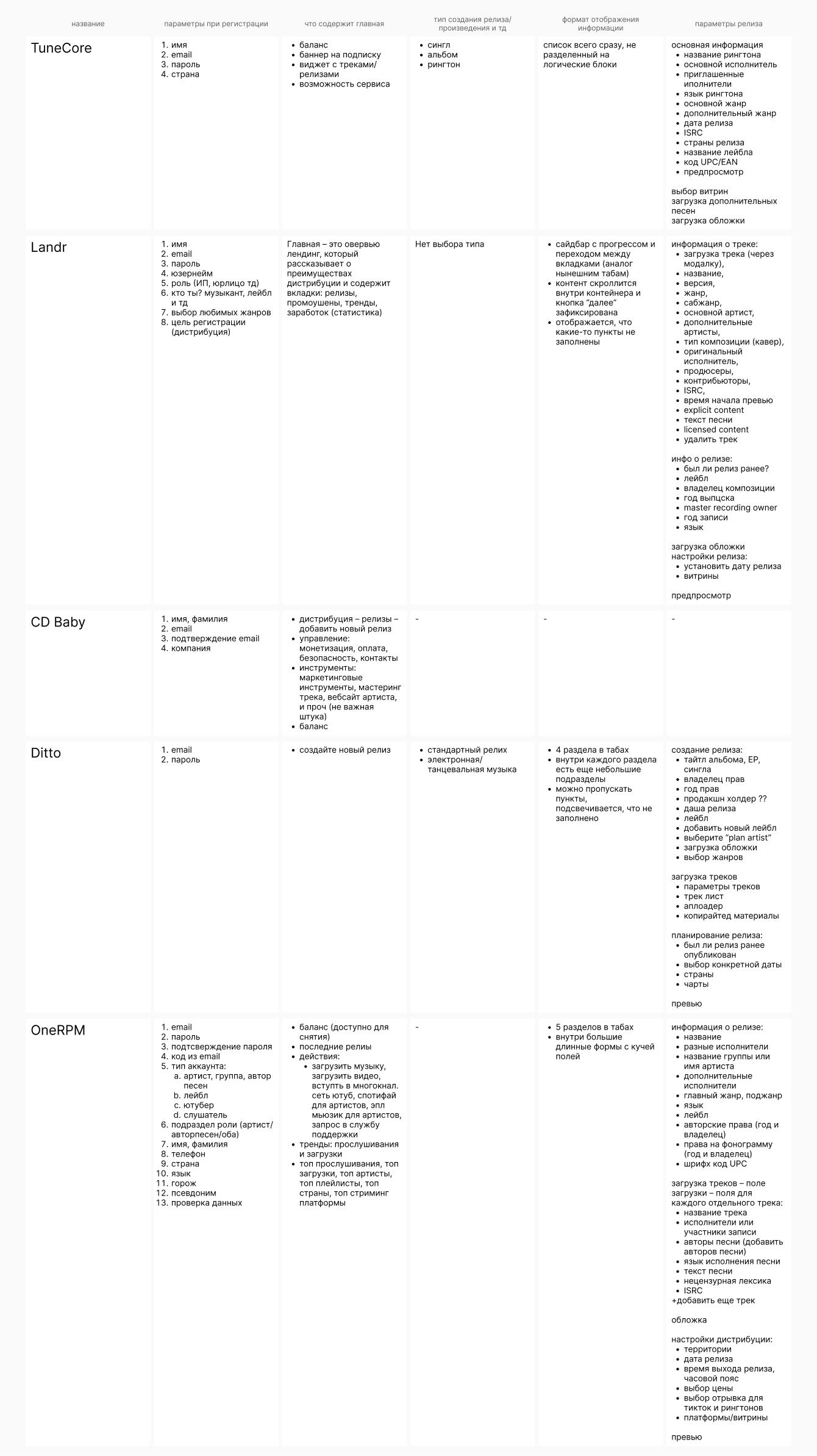
Analysis
During the analysis and redesign process, I studied the patterns of leading services in content licensing, fintech, and SaaS. The research helped build an updated UX and visual language for the platform while maintaining functionality.
Insights on UX patterns:
- Competitors' main pages serve not only a navigational but also a functional role: they help users orient themselves or guide them to target actions (upsell, activation, repeat logins).
- Forms are a key area of focus: services reduce the number of fields, break long processes into short steps, and use different field formats for ease of completion.
- The color palette of most systems is limited to two primary colors and additional shades for graphics — this helps focus attention on the data.
- Registration is maximally simplified — a minimal number of steps increases conversion and reduces churn.
- Many products allow users to explore the platform before payment, limiting some functionality — this builds trust and lowers the entry barrier.
- Light interface themes are most commonly used: they ensure better readability of forms and tables and are perceived as a “working” standard.
- Modern solutions move away from excessive graphics: minimal decorative elements, gradients, and illustrations, with a focus on data and clear structure.
Key conclusions for the Broma16 project
- Users expect simplicity and transparency in complex processes — especially when dealing with financial and legal data.
- Relying on a clean visual system and functional forms makes the interface more trustworthy.
- Minimalism in color and graphics helps users focus on content rather than visual noise.
- Well-structured architecture and concise UI directly impact the efficiency and speed of specialists' work.
Competitive analysis
Platform bottlenecks:
- Navigation and structure
The service has grown, and users got confused in the menu, unable to quickly find the necessary sections.
- Data handling
Large tables and reports appeared overloaded, making it difficult to analyze information.
- Errors and system states
The system poorly communicated errors, and users did not understand what to do next.
- Onboarding
New users did not immediately understand how to work with the platform; the entry process was 'cold'.
- Mobile version
The interface was optimized only for desktop.
- Unified visual language
The old interface was assembled fragmentarily, and elements looked different.
- Speed of operation.
Users complained that the interface was overloaded and 'lagged'.
- Trust and transparency
Users were concerned that data might 'get lost' or not be saved.
Result
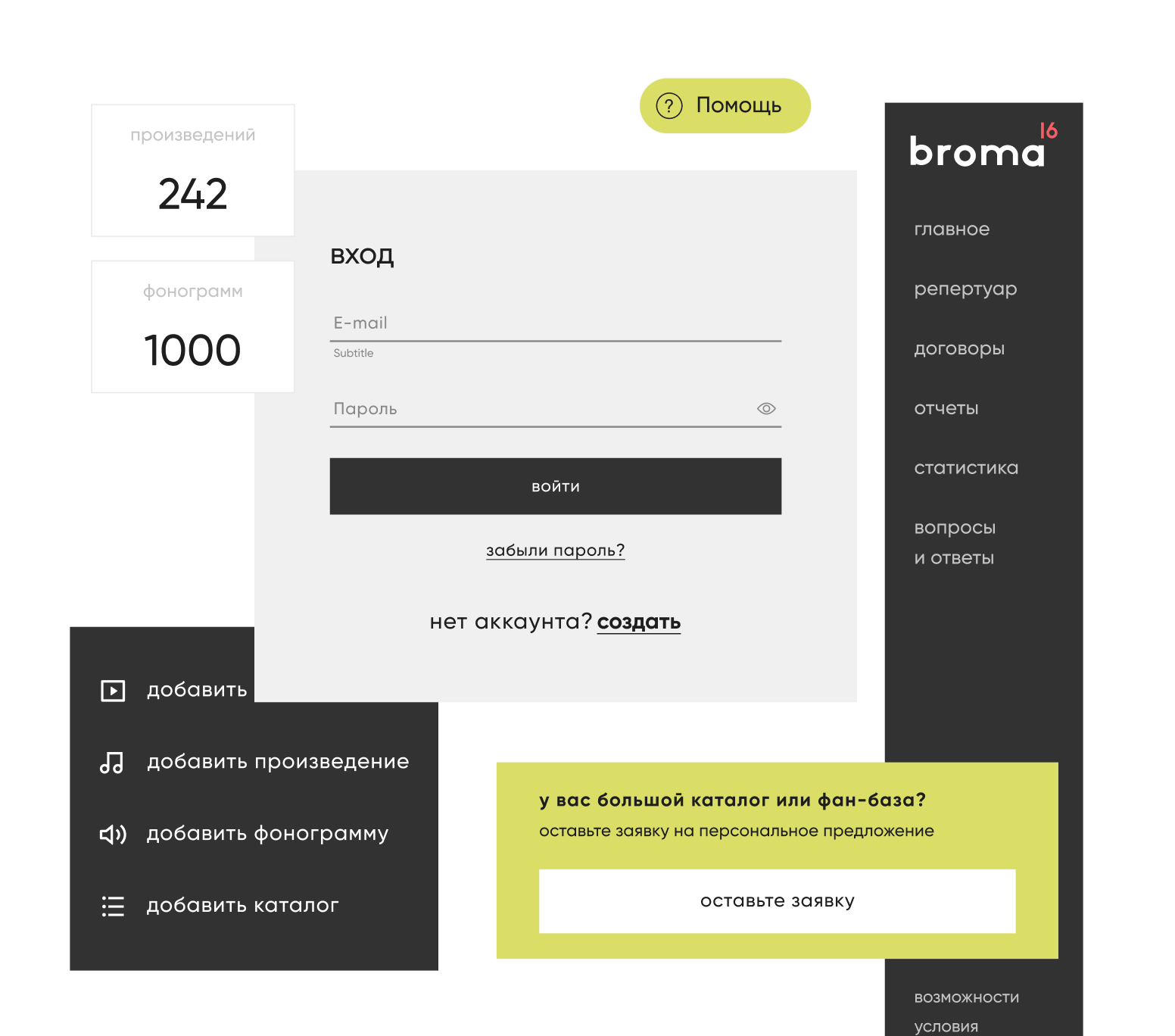
Before
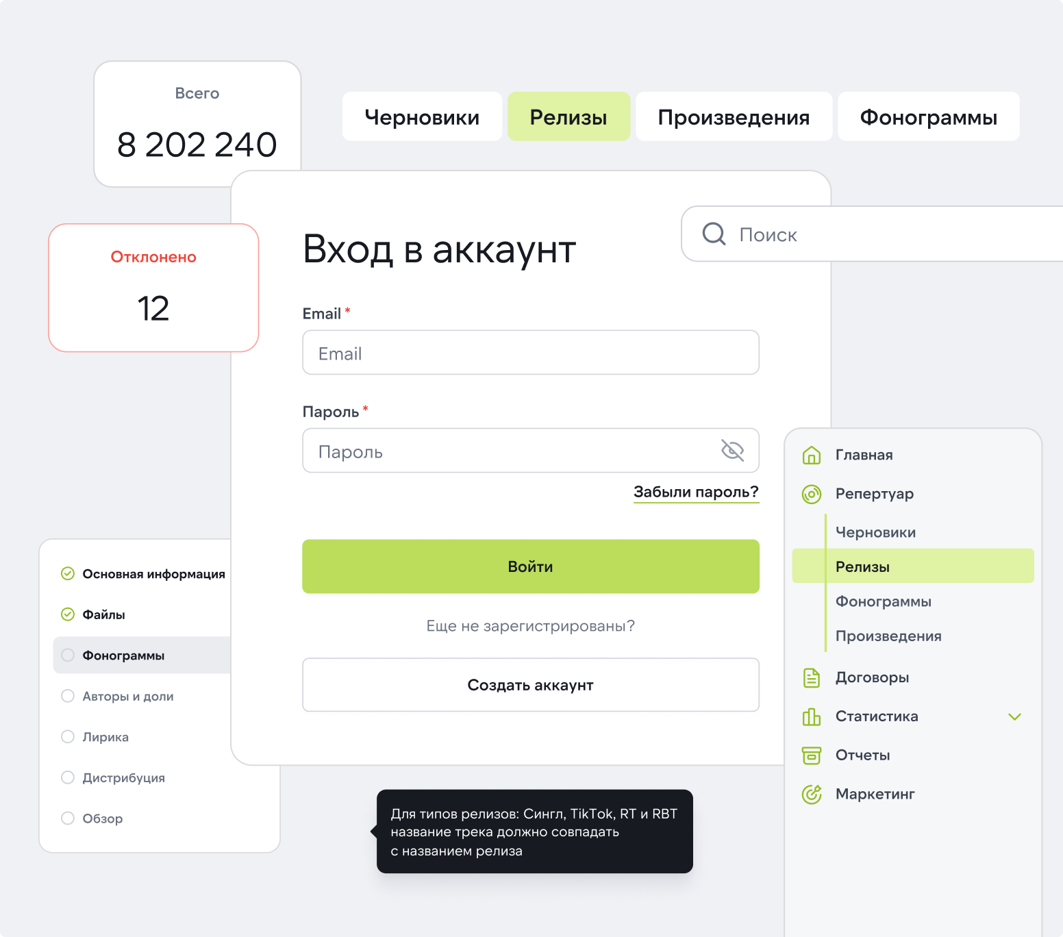
After
The main result is an increase in efficiency and user trust while maintaining the functional depth of the platform.
- Registration became three times faster: from 1.5 hours to 30 minutes.
- The number of support requests decreased by ~40% due to prompts and well-thought-out error messages.
- Navigation became intuitive: users find the necessary sections faster.
- Data handling became more convenient: filters, grouping, and export were added.
- User satisfaction increased (according to manager feedback and internal surveys).
- Responsiveness expanded usage scenarios — now available on both tablets and smartphones.
- The implementation of the UI kit accelerated the development of new features and made the product cohesive.
Back
Redesign of the Broma 16 Platform

Operational period: 2024. Platform: Web and responsive version for tablets and smartphones
My role is UX/UI designer
- Support for the current version of the platform.
- Complete redesign of interfaces.
- Analysis of user scenarios and design of new ones.
Project goal
Разработать мобильное приложение для усиления цифрового присутствия, повышения лояльности клиентов и удобного онлайн-шопинга
About the client
Broma 16 is an independent music company that licenses rights to digital content and pays royalties to authors, performers, labels, and publishers. The service brings together over 600 rights holders worldwide and collaborates with platforms like Apple Music, YouTube, Deezer, VK, Yandex.Music, and others.
Authorization
Tasks
- Update the overall interface style;
- Identify and address bottlenecks;
- Incorporate new policy rules in the concept to standardize product texts and descriptions;
- Adapt layouts for tablets and smartphones;
- Prototype and test hypotheses;
- Create a new design system;
- Introduce new interface patterns to make the product scalable and ready for functional expansion.
Process
1. Analysis and research
- Conducted interviews with managers and users of the platform.
- Analyzed data structure, reporting logic, and typical scenarios.
- Built a CJM map and identified key frustration points.
2. UX design
- Reconstructed the information architecture.
- Optimized registration, reporting, and search scenarios, etc.
- Created interactive prototypes for key processes.
3. UI design
- Developed a unified visual language: colors, typography, components.
- Implemented a UI kit for interface consistency.
- Prepared responsive versions for tablets and smartphones.
Analysis
During the analysis and redesign process, I studied the patterns of leading services in content licensing, fintech, and SaaS. The research helped build an updated UX and visual language for the platform while maintaining functionality.
Insights on UX patterns:
- Competitors' main pages serve not only a navigational but also a functional role: they help users orient themselves or guide them to target actions (upsell, activation, repeat logins).
- Forms are a key area of focus: services reduce the number of fields, break long processes into short steps, and use different field formats for ease of completion.
- The color palette of most systems is limited to two primary colors and additional shades for graphics — this helps focus attention on the data.
- Registration is maximally simplified — a minimal number of steps increases conversion and reduces churn.
- Many products allow users to explore the platform before payment, limiting some functionality — this builds trust and lowers the entry barrier.
- Light interface themes are most commonly used: they ensure better readability of forms and tables and are perceived as a “working” standard.
- Modern solutions move away from excessive graphics: minimal decorative elements, gradients, and illustrations, with a focus on data and clear structure.
Key conclusions for the Broma16 project
- Users expect simplicity and transparency in complex processes — especially when dealing with financial and legal data.
- Relying on a clean visual system and functional forms makes the interface more trustworthy.
- Minimalism in color and graphics helps users focus on content rather than visual noise.
- Well-structured architecture and concise UI directly impact the efficiency and speed of specialists' work.
Competitive analysis
Platform bottlenecks:
- Navigation and structure
The service has grown, and users got confused in the menu, unable to quickly find the necessary sections.
- Data handling
Large tables and reports appeared overloaded, making it difficult to analyze information.
- Errors and system states
The system poorly communicated errors, and users did not understand what to do next.
- Onboarding
New users did not immediately understand how to work with the platform; the entry process was 'cold'.
- Mobile version
The interface was optimized only for desktop.
- Unified visual language
The old interface was assembled fragmentarily, and elements looked different.
- Speed of operation.
Users complained that the interface was overloaded and 'lagged'.
- Trust and transparency
Users were concerned that data might 'get lost' or not be saved.
Result
Before
After
The main result is an increase in efficiency and user trust while maintaining the functional depth of the platform.
- Registration became three times faster: from 1.5 hours to 30 minutes.
- The number of support requests decreased by ~40% due to prompts and well-thought-out error messages.
- Navigation became intuitive: users find the necessary sections faster.
- Data handling became more convenient: filters, grouping, and export were added.
- User satisfaction increased (according to manager feedback and internal surveys).
- Responsiveness expanded usage scenarios — now available on both tablets and smartphones.
- The implementation of the UI kit accelerated the development of new features and made the product cohesive.
Back
Redesign of the Broma 16 Platform

Operational period: 2024. Platform: Web and responsive version for tablets and smartphones
My role is UX/UI designer
- Support for the current version of the platform.
- Complete redesign of interfaces.
- Analysis of user scenarios and design of new ones.
Project goal
Redesign of the platform to improve UX, increase user trust, and speed up data handling
About the client
Broma 16 is an independent music company that licenses rights to digital content and pays royalties to authors, performers, labels, and publishers. The service brings together over 600 rights holders worldwide and collaborates with platforms like Apple Music, YouTube, Deezer, VK, Yandex.Music, and others.
Authorization
Tasks
- Update the overall interface style;
- Identify and address bottlenecks;
- Incorporate new policy rules in the concept to standardize product texts and descriptions;
- Adapt layouts for tablets and smartphones;
- Prototype and test hypotheses;
- Create a new design system;
- Introduce new interface patterns to make the product scalable and ready for functional expansion.
Process
1. Analysis and research
- Conducted interviews with managers and users of the platform.
- Analyzed data structure, reporting logic, and typical scenarios.
- Built a CJM map and identified key frustration points.
2. UX design
- Reconstructed the information architecture.
- Optimized registration, reporting, and search scenarios, etc.
- Created interactive prototypes for key processes.
3. UI design
- Developed a unified visual language: colors, typography, components.
- Implemented a UI kit for interface consistency.
- Prepared responsive versions for tablets and smartphones.
Analysis
During the analysis and redesign process, I studied the patterns of leading services in content licensing, fintech, and SaaS. The research helped build an updated UX and visual language for the platform while maintaining functionality.
Insights on UX patterns:
- Competitors' main pages serve not only a navigational but also a functional role: they help users orient themselves or guide them to target actions (upsell, activation, repeat logins).
- Forms are a key area of focus: services reduce the number of fields, break long processes into short steps, and use different field formats for ease of completion.
- The color palette of most systems is limited to two primary colors and additional shades for graphics — this helps focus attention on the data.
- Registration is maximally simplified — a minimal number of steps increases conversion and reduces churn.
- Many products allow users to explore the platform before payment, limiting some functionality — this builds trust and lowers the entry barrier.
- Light interface themes are most commonly used: they ensure better readability of forms and tables and are perceived as a “working” standard.
- Modern solutions move away from excessive graphics: minimal decorative elements, gradients, and illustrations, with a focus on data and clear structure.
Key conclusions for the Broma16 project
- Users expect simplicity and transparency in complex processes — especially when dealing with financial and legal data.
- Relying on a clean visual system and functional forms makes the interface more trustworthy.
- Minimalism in color and graphics helps users focus on content rather than visual noise.
- Well-structured architecture and concise UI directly impact the efficiency and speed of specialists' work.
Competitive analysis
Platform bottlenecks:
- Navigation and structure
The service has grown, and users got confused in the menu, unable to quickly find the necessary sections.
- Data handling
Large tables and reports appeared overloaded, making it difficult to analyze information.
- Errors and system states
The system poorly communicated errors, and users did not understand what to do next.
- Onboarding
New users did not immediately understand how to work with the platform; the entry process was 'cold'.
- Mobile version
The interface was optimized only for desktop.
- Unified visual language
The old interface was assembled fragmentarily, and elements looked different.
- Speed of operation.
Users complained that the interface was overloaded and 'lagged'.
- Trust and transparency
Users were concerned that data might 'get lost' or not be saved.
Result
Before
After
The main result is an increase in efficiency and user trust while maintaining the functional depth of the platform.
- Registration became three times faster: from 1.5 hours to 30 minutes.
- The number of support requests decreased by ~40% due to prompts and well-thought-out error messages.
- Navigation became intuitive: users find the necessary sections faster.
- Data handling became more convenient: filters, grouping, and export were added.
- User satisfaction increased (according to manager feedback and internal surveys).
- Responsiveness expanded usage scenarios — now available on both tablets and smartphones.
- The implementation of the UI kit accelerated the development of new features and made the product cohesive.